What is a logo? What makes a logo good? Which are the best? If you do a search for “the greatest logos of all time”, you will find a lot of lists. Most include the same set of logos with only slight variations in their rankings and few list makers explain their rationale. For all those learning logo design or those trying to enlarge their understanding of them, here is a list of the ten greatest logos ever made. It should be noted that these rankings are based not on some subjective aesthetic criteria or ingenious marketing efforts. I chose logos which demonstrate the highest order application of good logo design principles.
1 Apple
A logo is a symbol. Apple’s logo is the strongest logo ever created. It doesn’t need a typographical element because the iconography is the word itself. Apple’s logo is literally the precise embodiment of a logograph, “a sign or character representing a word”
2 Herman Miller

A logo is dynamic and memorable. Herman Miller’s logo never appears on a top 50 list and it’s a shame. The simplicity, the lines, and the shape make it incredibly dynamic and memorable.
3 Nike
A logo does not give meaning, but is given meaning. Nike’s logo might be debatable as a top 10 logo; It’s nothing special, it’s just a swoosh. Even the founder didn’t really like it when it was created. With that said, it’s the third greatest logo of all time because it shows that a logo doesn’t give meaning but is given meaning. It’s given meaning if it represents quality.
4 Adidas Originals
Form follows function. Those three iconic stripes were used to functionally make the shoes durable. The form of the logo followed suit.
5 IBM
Keep it simple. You can’t have a list or learn simplicity without studying Paul Rand. The IBM logo is objectively one of the best logos of all time, you could pick any of Rand’s work, but IBM might be his best.
6 Braun
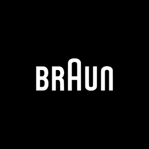
You learn the rules so you can break them. Braun breaks the rules better than anyone in their logo by blending uppercase and lower case type to seamlessly incorporate that iconic rounded A.
7 Union Binding Co.

Do one thing and do it better than anyone else. Aaron Draplin, like Paul Rand, should be included in every list. He might not work in a vast range like Paul Rand, Saul Bass, or Milton Glaser, but his thick lines and appreciation for timeless, simple, and — as he puts it, “cool shit”, make his Union Binding Co. logo one of the best ever.
8 AVA
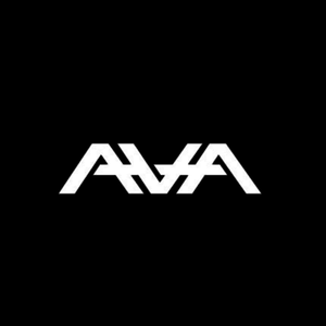
Blend typography and iconography together. The Angels & Airwaves logo blends type and symbolism to create a hybrid symbol which is synonymous with the band. The logo for this San Diego based band is geometric, dynamic, and has meaning. The typographical element — the name Ava — is Tom DeLonge’s daughter and the reason for the breakup of blink-182 and the creation of Angels & Airwaves. The blend makes this little gem powerful.
9 I love New York
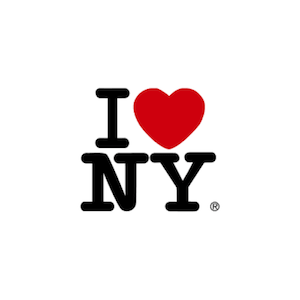
A logo is memorable. Want to make your logo stick? Make it a puzzle according to Milton Glaser. He theorizes that by making “I love New York” into a puzzle, the satisfaction and the good feeling of solving it makes the viewer remember it. The proliferation and copycats of the logo are strong evidence that Glaser is correct.
10 Johnny Walker
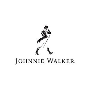
A good logo is never trendy and therefore, never appears dated. The Johnnie Walker logo, like that of Ralph Lauren and others of this type, pulls together a traditional look that is simply timeless.